Rather than expecting users to consume information and compare our services — there is a lot that we offer — to pick a treatment center, we aim to provide a more straightforward experience.
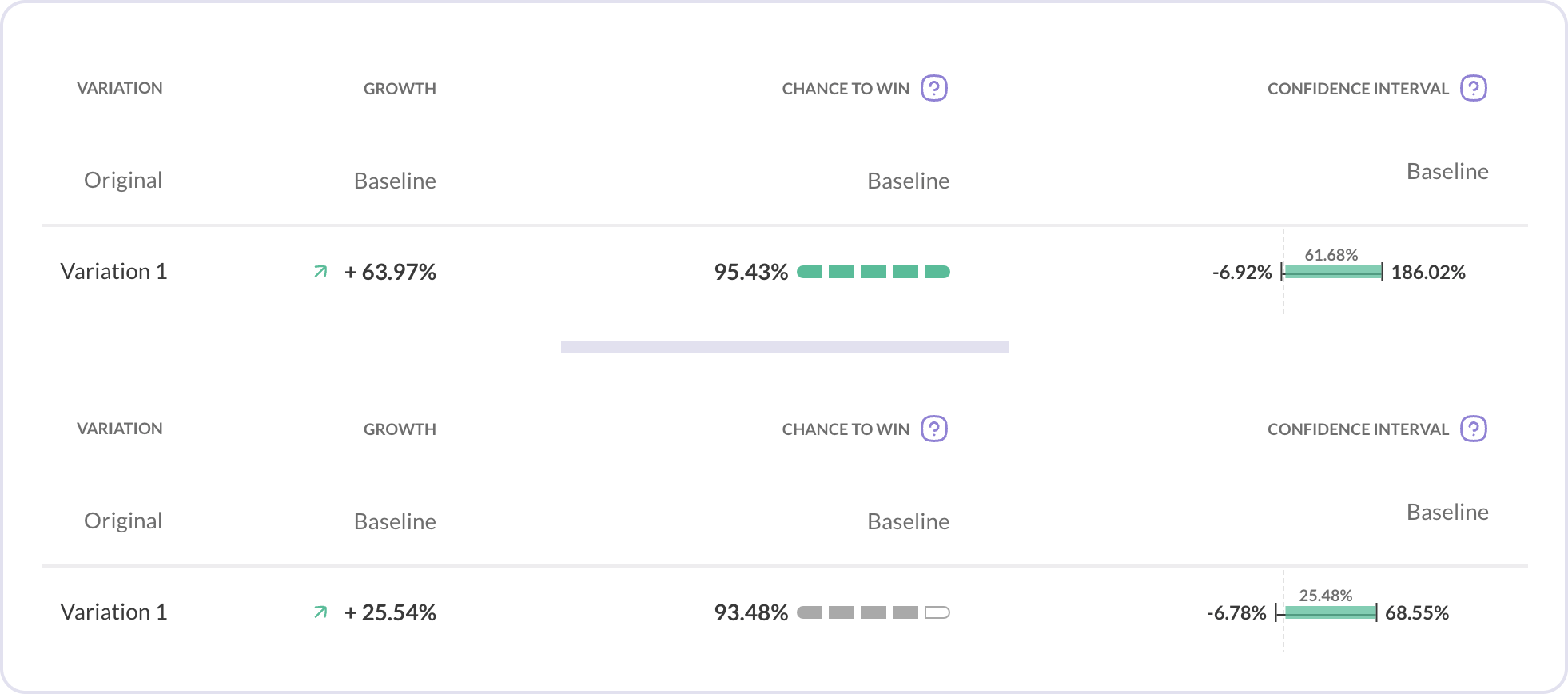
The current design is not effectively engaging users, as evidenced by the fact that 94.7% of them were leaving the page without reaching the conversion element. Additionally, during the first impression test, I noticed that users giving up on navigating through the page due to the overwhelming amount of information presented.
The users were also struggling to understand the terms used in the filters designed to help them narrow down their search.
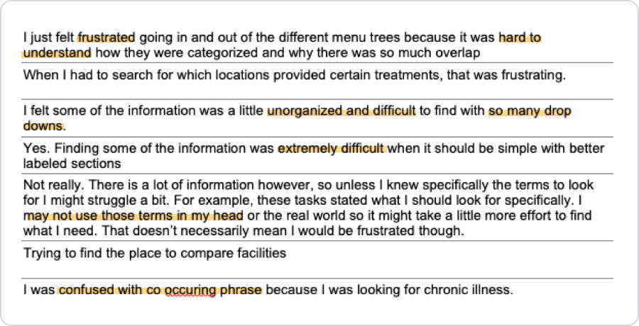
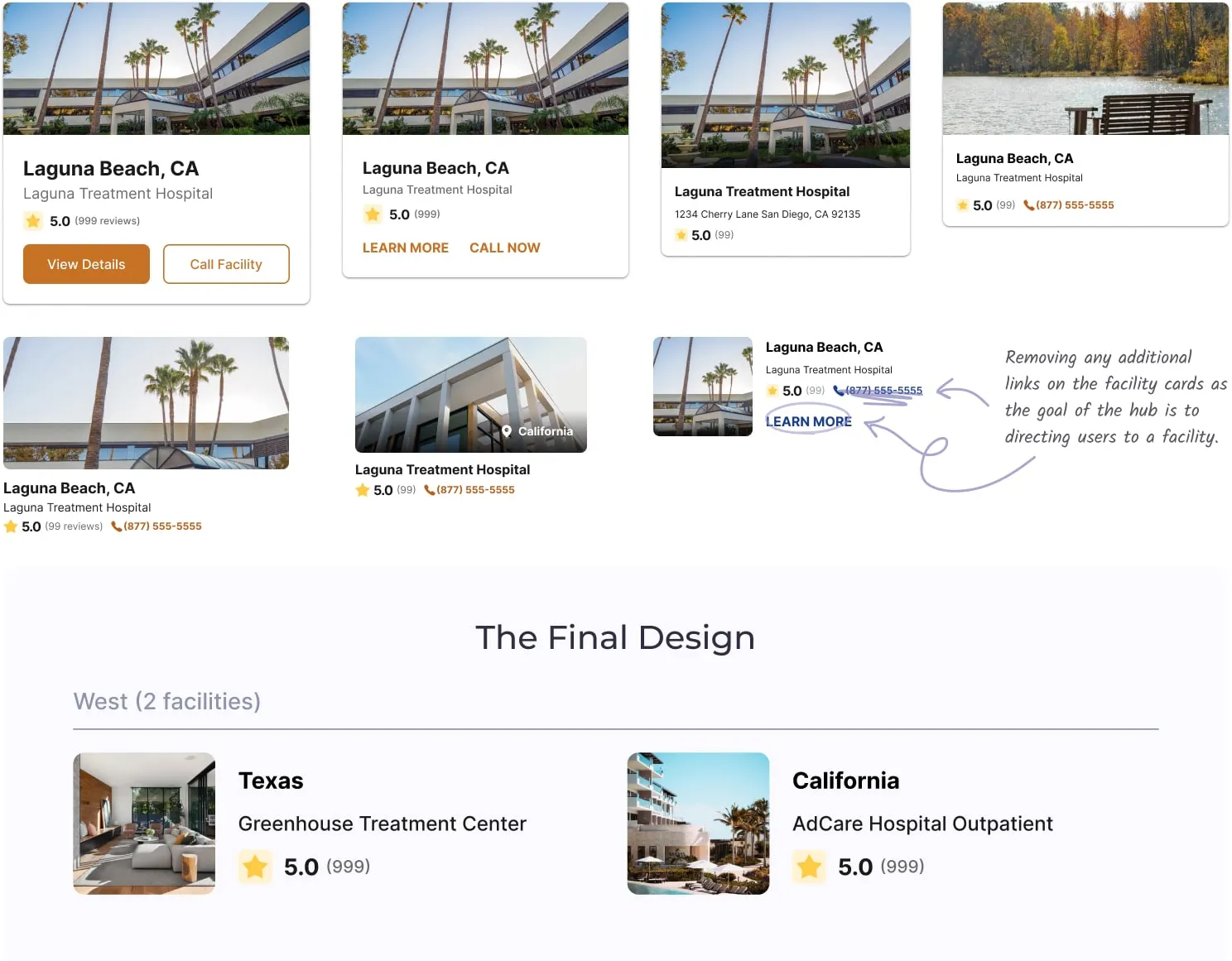
To tackle the information overload problem, I considered removing any unnecessary information in the facility cards to help reduce the cognitive burden on our users and ensure that the most important information is communicated effectively.
While it's crucial to address the current issues, creating a great user experience requires me to revisit the initial research and get answers to more questions.
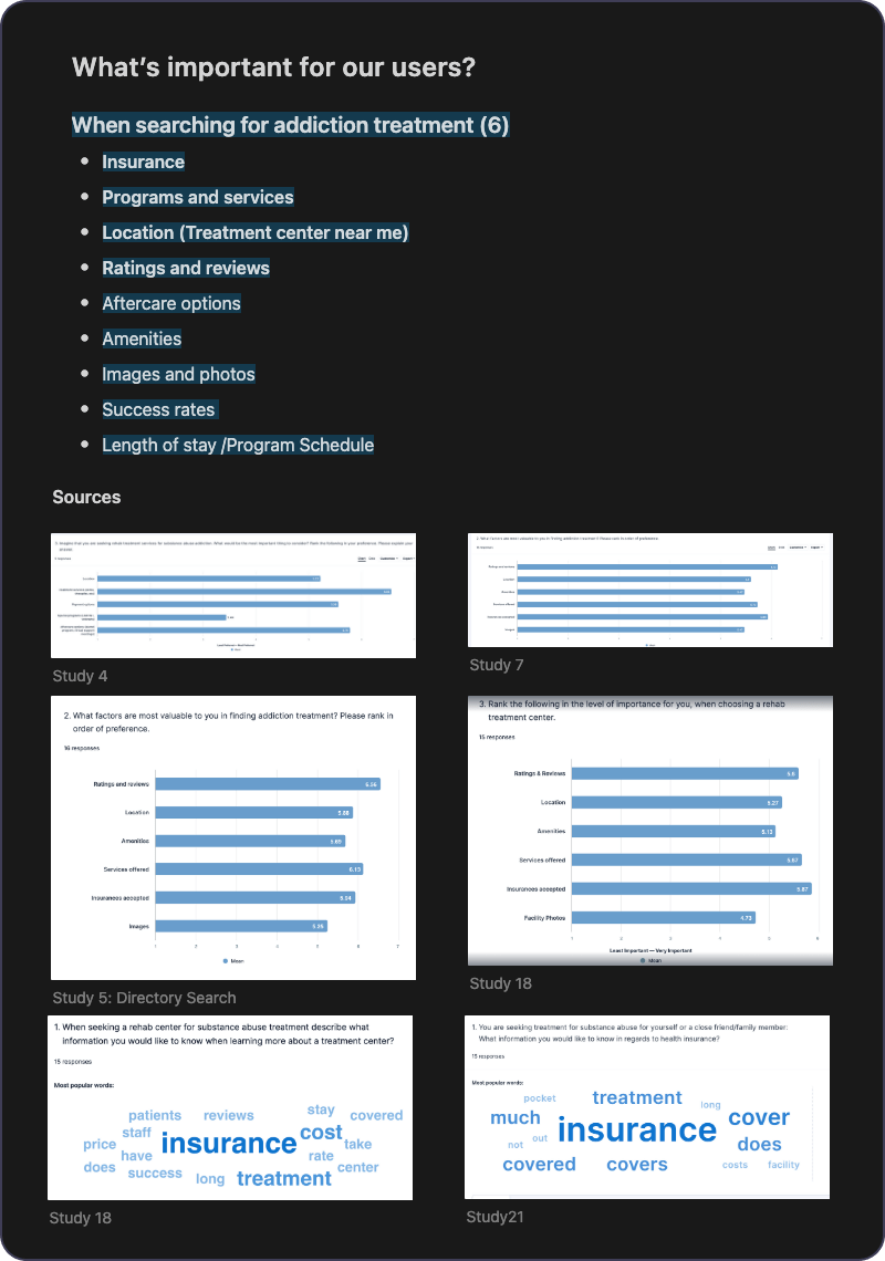
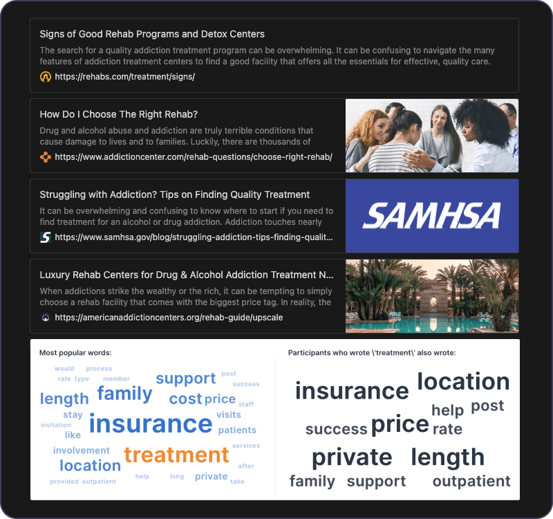
I reviewed my previously conducted meta-analysis of user research studies to refresh our memory on the key factors that our users prioritize when searching for addiction treatment. This analysis provides the necessary groundwork for designing Rehab Centers Hub.
To gain a deeper understanding of our users and their needs, I delved deeper into the research and gathered some additional resources on choosing the best rehab center. This includes articles from SAMHSA, our competitors, and our own in-house research on the topic.
With the above research, I created these potential statements that people can choose from to receive tailored treatment recommendations that best fit their needs. I used a first-person narrative to make this information more relatable and easier to understand.
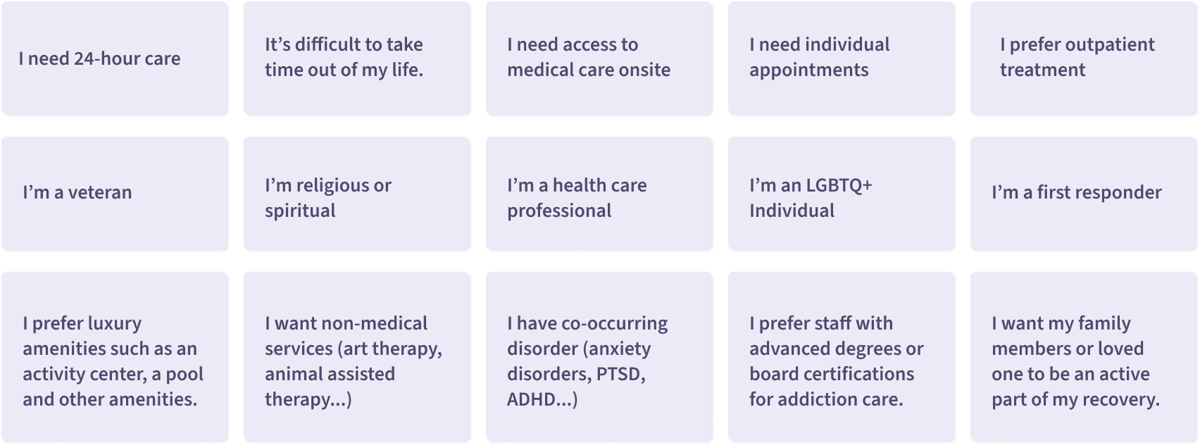
After drafting the statements, I presented them to the team for discussion and feedback. Incorporating the input from developers, content writers, and product owners, I refined the design with these additional considerations and arrived at the final version:
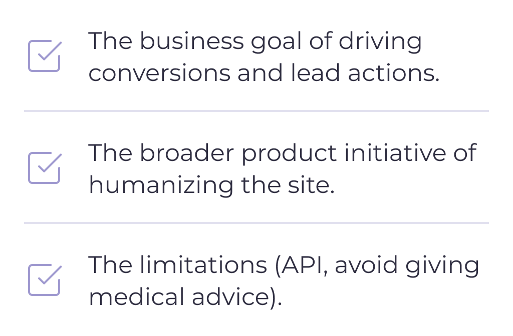
To address the top concern of paying for treatment, I changed the main call-to-action to verify insurance, which also helps us meet our business goals. I used soft colors and illustrations to create a more inviting atmosphere on this page, aligning with our goal of humanizing the experience and providing a welcoming environment for those seeking help.
As users cannot view the tile filters and results simultaneously, I changed the facility recommendation component into a two-step process with a "Show Recommended Facilities" button to optimize for mobile. By clicking on the button and viewing the results, users are informed that the component is working correctly.
I also added a message for users who select "State Not Listed" in the location dropdown, encouraging them not to give up on getting help and to consider traveling for rehab.
