Because no single team owned the flow, no documentation existed. My first step wasn't design,it was forensic auditing.
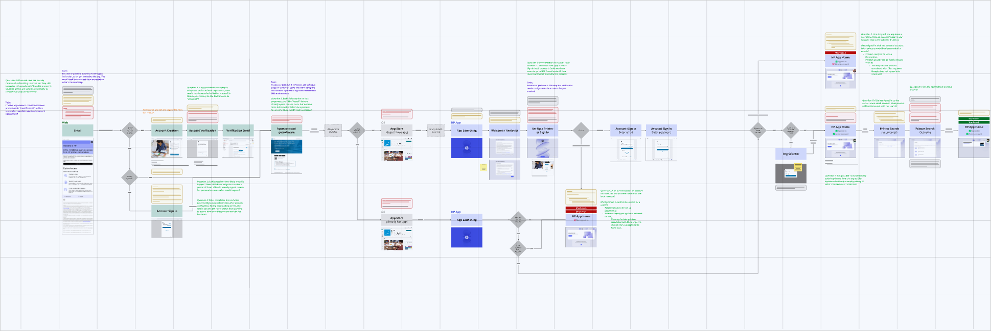
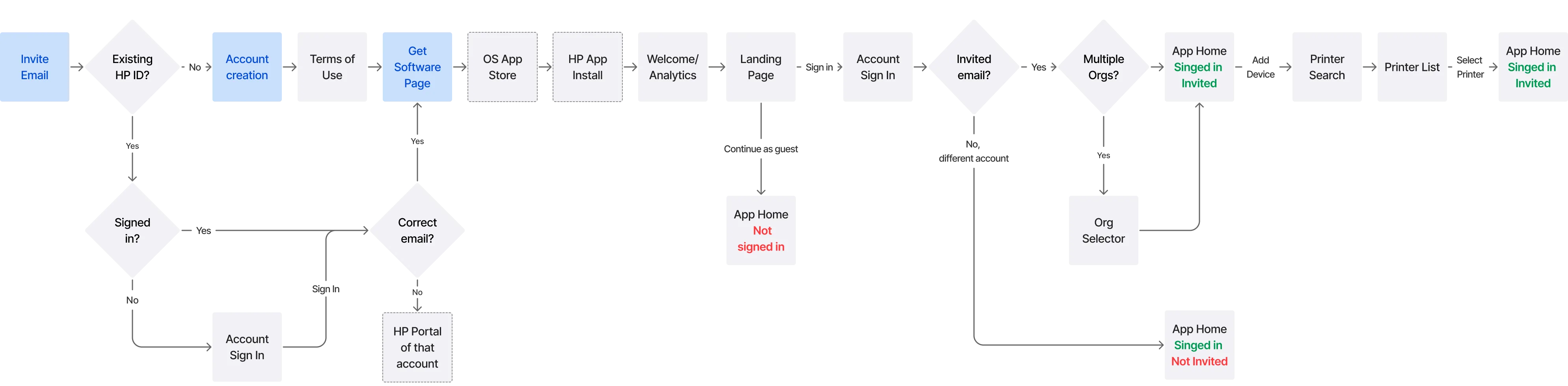
I initiated a forensic audit of the current state, using visual maps (Miro) to force alignment. After chasing down fragmented answers from developers and PMs, I used Copilot to quickly synthesize their notes and define the technical constraints for Windows, Mac, and Mobile users.
We realized the upcoming AI rollout would expose this legacy friction. Since a complete overhaul wasn't feasible, I used Copilot to validate my assumptions regarding the engineering effort required for our proposed fixes. This allowed me to define a pragmatic, realistic phased strategy to align with product and development.
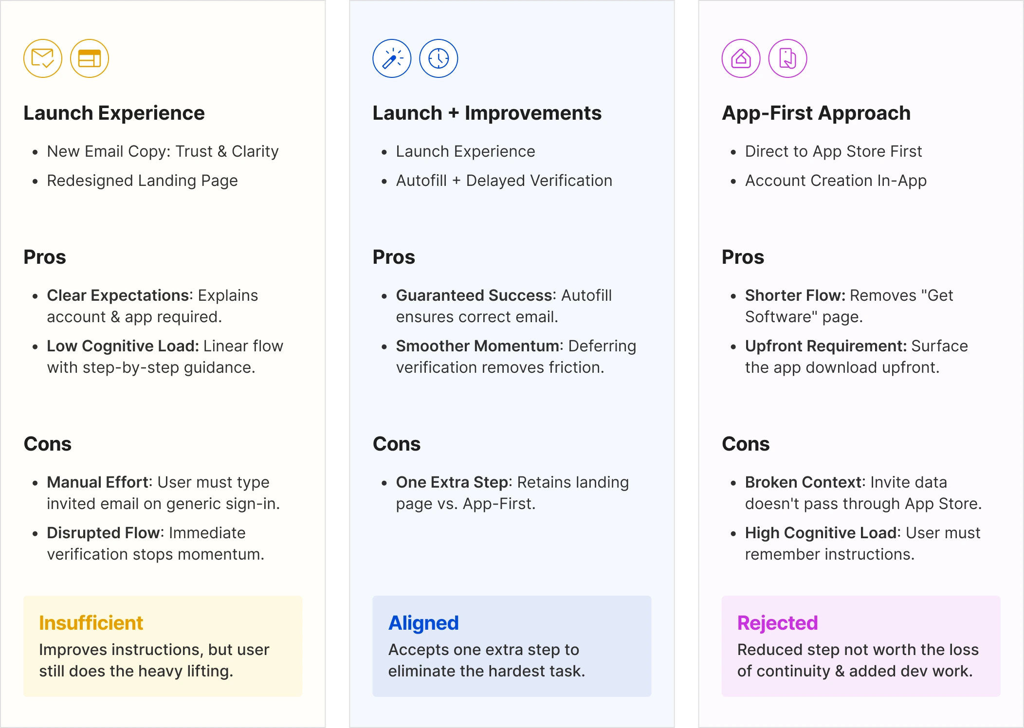
Short-Term: Immediate fixes like auto-filling emails during sign-up to reduce friction.
Mid-Term: Short-term improvements plus changes like auto-populating printers in the app that requires more dev work.
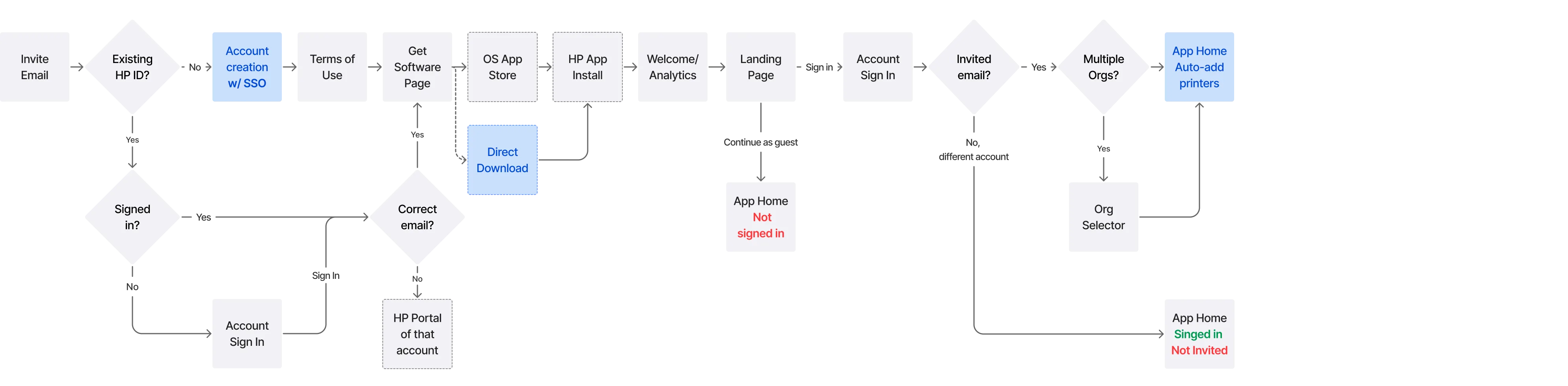
Long-Term: A complete architectural overhaul to remove the account requirements for a smooth, "zero friction" experience.
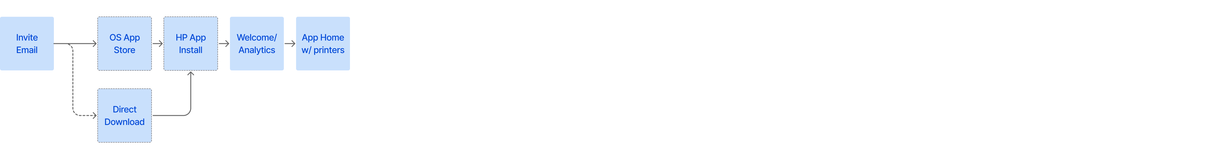
For the short-term phase, we immediately aligned on fixing the high-visibility defects: the invite email and app download page. However, the remaining scope was debated. Leadership challenged us to consider an alternative "app-first" approach.
To evaluate this potential pivot without stalling our timeline, I used AI-assisted prototyping in Figma Make to rapidly visualize the alternative concept. I then led the comparative analysis using these visuals to help the team weigh the risks and trade-offs. This comparison aligned the team on the final direction, enabling us to secure the engineering resources for the additional improvements outlined in my original proposal.
With the scope defined and resources secured for the Launch + Improvements path, I moved to execute the plan.
I specified email pre-population to prevent data entry error and ensure users set up account with correct email. I also defaulted the link to Account Creation, removing a click for the majority of users without an existing account. I then redesigned the two key touchpoints:
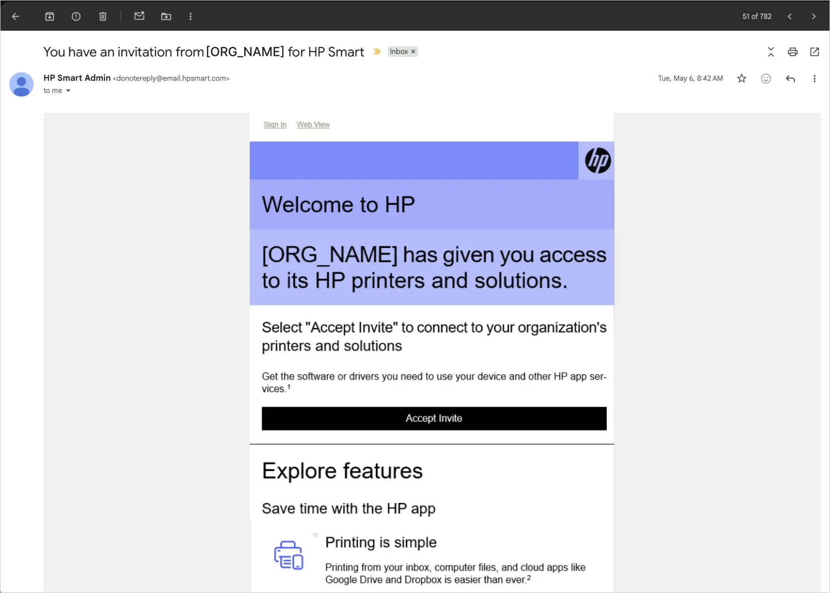
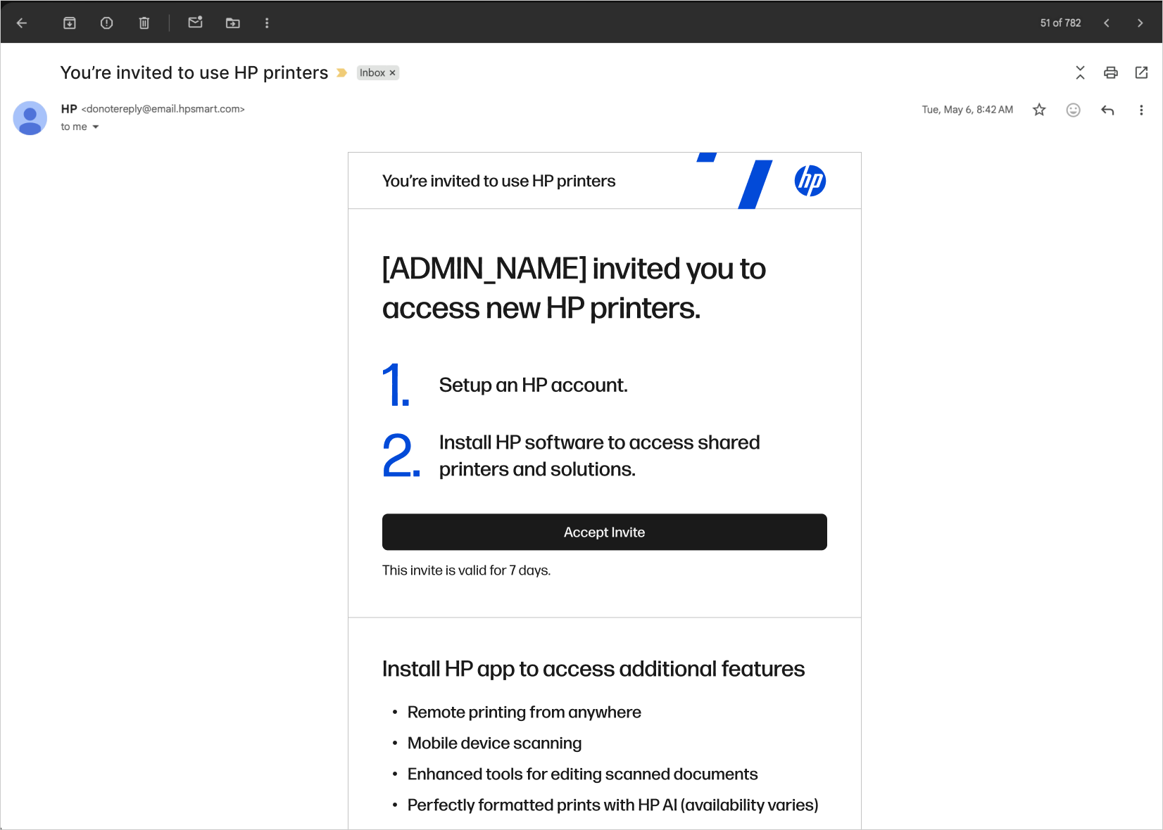
The legacy email was vague about requirements and often mistaken for marketing.
By defining a clear content structure for the copywriting and CRM teams, I ensured the messaging establishes trust and sets clear expectations regardless of final phrasing or template constraints.
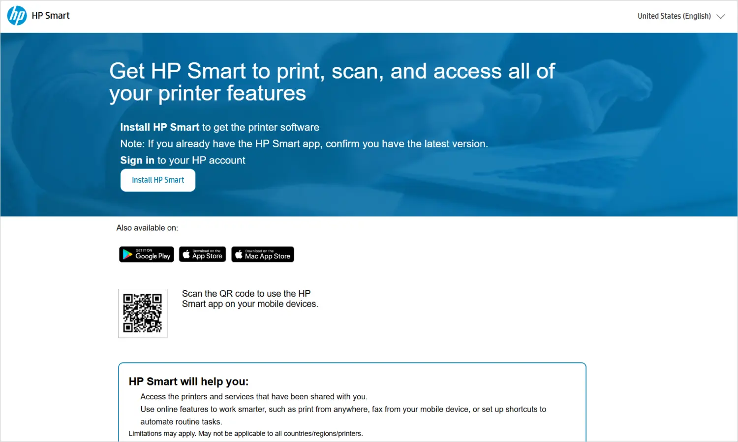
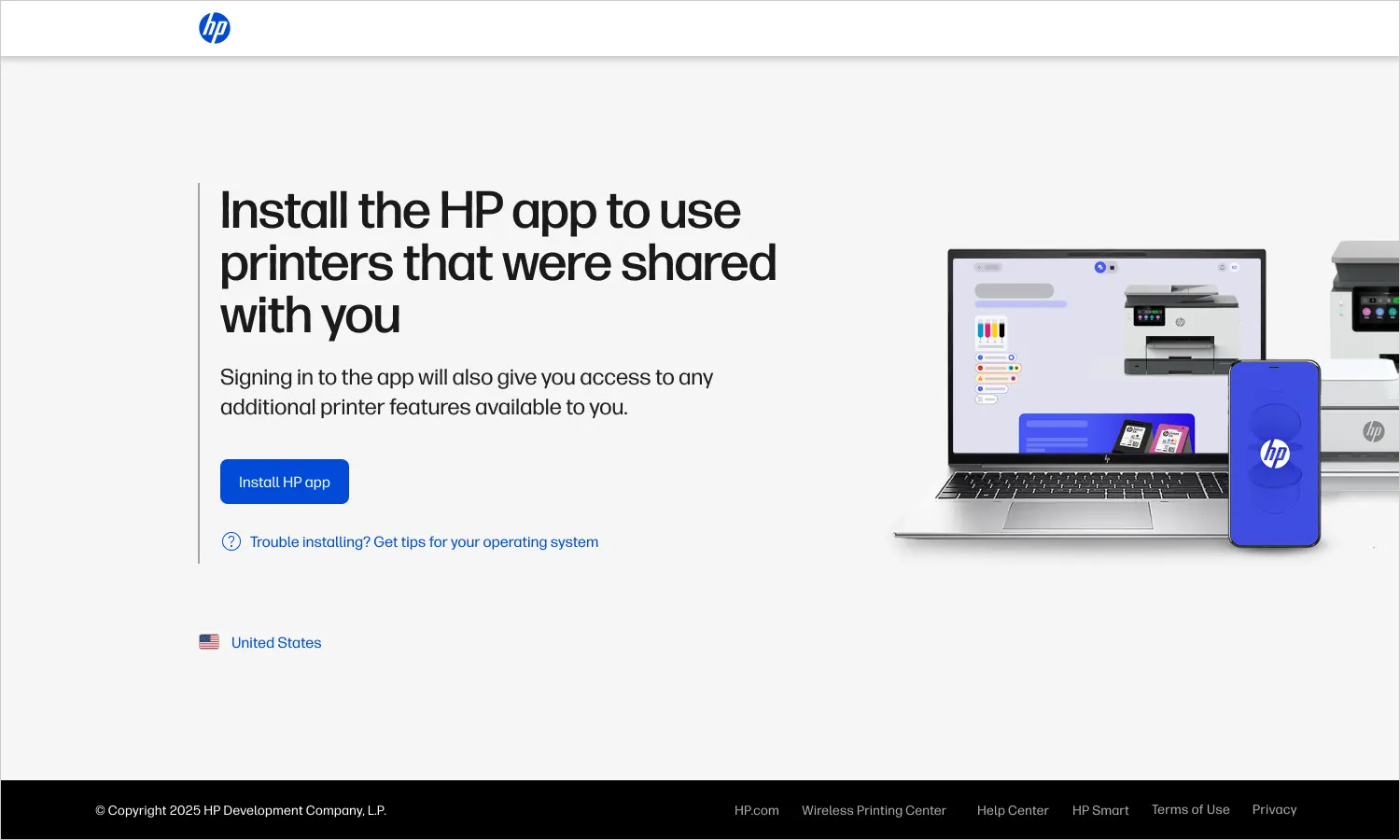
The legacy page suffered from information clutter and inconsistent visuals.
I removed the noise to provide clear orientation and progress visibility. By leveraging established HP patterns to create a single path forward, I ensured a fast, lightweight build.